Background
Let's name your project

Select the type of data for your project
ChartPixel
ChartPixel Brand Logo
Coming soon...
City background shallow City background medium City background deep
Our vision

We believe that data holds tremendous power, but we understand that it can also be overwhelming and complex for many. That's why we're here to assist you every step of the way on your data-driven journey.

Our mission is to demystify data and analysis, making it accessible to everyone, regardless of skill level. We're committed to providing you with a transparent and simplified approach to understanding and utilizing data effectively.

Our tool

We want to empower you to make sense of data. We've developed a user-friendly platform that brings people and data closer together. With our intuitive, fun, and educational tools, you can easily collect, visualize, and analyze data without any hassle.

Whether you're a beginner or have already seasoned analytics skills, our platform is designed to guide you through the process effortlessly.

Our mission

We aspire to bring data and people closer together by supporting and empowering users through innovation and simplicity.

Map Charts
in 30 seconds

Simply paste your data and generate AI-assisted country and state-level charts.

  • Automatically create interactive maps of the world, continents, countries and states from your list or tables.
  • See locations from zip codes or latitudes/longitudes.
  • Aggregate, analyze or customize your maps with one simple click.

Understand
your data in
30 seconds

Effortlessly make sense of your data with the most important charts, AI-assisted actionable insights and statistics.

AI questionnaire analysis with ChartPixel
Trusted by thousands of academics and researchers who used ChartPixel for their data analysis needs
A girl riding a rocket symbolizing the zero learning curve of ChartPixel

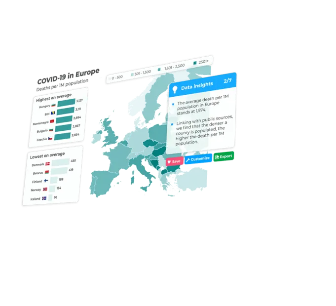
Create maps without the hassle

ChartPixel automatically spell-checks or translates your country and state names and can instantly create beautiful maps for you. States are automatically color-coded and you can even add locations from your zip codes or addresses.

Map of Europe
A man relaxing symbolizing the high security of ChartPixel's AI

Data privacy and security in your hands

You can simply encode any personal or sensitive data such as email or addresses and decode it back at your end. And rest assured, we do not "train" on your data or send your raw data back and forth to external LLMs, and thus providing you with results that you can trust and rely on.

Donorsearch Ranked #2 in AI tools for Data Analyists & Insights Ranked #3 in Top 10 AI Data Analysis Tools DataAdepts' winnner in Top 10 AI tools for every data analyst MS Poweruser Ranked #4 in AI for Data Visualization Chosen Top 5 Data Analysis Tools by AI Trail
A lightbulb representing the inssights you get when analysing with ChartPixel

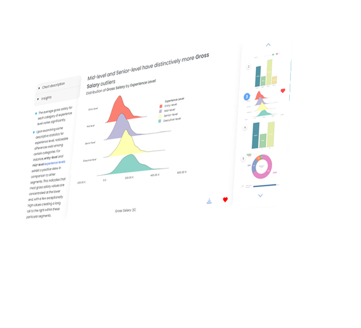
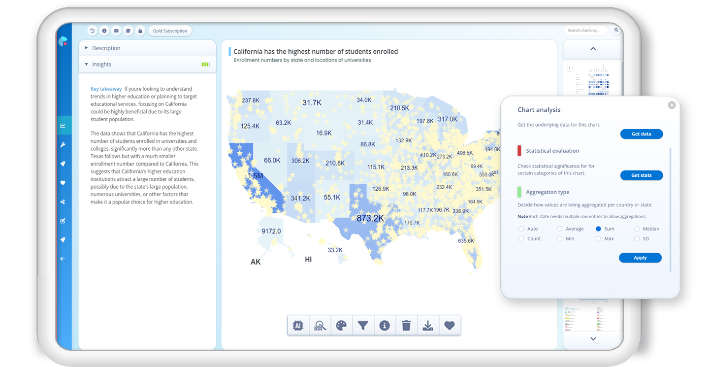
Dive even deeper into your map charts

ChartPixel goes beyond offering automated map charts. Get suggested titles and explained insights together with your maps. You can also aggregate and analyze your data, find out which states are outliers, or what factors in your data drive the outcome.

Find out more
1
Upload your data Drop or upload Excel, CSV files. Explore other upload options such as reading tables from websites, keyword search.
2
Lean back No need to select columns or chart types or format your data. ChartPixel tidies up and enhances your data to create the most insightful charts..
3
Get your charts and more All charts are explained with written insights. Customize further, share online, embed, or export into PowerPoint in a click..
Explore the tool
AI job salaries
Arrow to open description
Sample data screen Sample screen of analyzing AI salaries data and know what is trending
Find out which jobs and countries have the highest AI job salaries and track interesting trends in the AI sector.

(Data source: ai-jobs.net)

Survey
Arrow to open description
Sample data screen Screen showing easy forecasts and financial and stock market data analysis
Uncover insights into customer satisfaction at a coffee shop, informing strategies to enhance customer experience, loyalty, and recommendation rates.
Customer survey
Arrow to open description
Sample data screen Sample screen of analyzing questionnaires of a hypothetical coffee shop
Uncover insights into customer behavior from a coffee shop survey, revealing strategies to enhance customer experience, loyalty, and recommendation rates.
Arrow to open description
Sample data screen Screen showing charts from current data such as Covid-19 cases
Titanic
Arrow to open description
Sample data screen Sample screen of analyzing a classical research dataset
The classic Titanic dataset used by learners of data analysis around the world sheds light on key factors influencing survival during the historic disaster.
Sample data screen Professional Professional Researcher Journalist or Doctor Sailor Football player Sample screen of analyzing AI salaries data and know what is trending Sample screen of analyzing questionnaires of a hypothetical coffee shop Analyze and understand current data Sample screen of analyzing a classical research dataset

What our users say about us

ChartPixel kickstarts my research by identifying patterns and relationships that truly matter without wasting time. This has been invaluable for my research.

Dr Baba Sheba
Director of Digital Education
St George's University

The UI is so easy to navigate with many user-friendly features. A great tool that has been improving every day, which is a testament to the care and commitment of its developers!

Connor Hobbins
Former student

MSc Accounting and Finance

A tool so cool your data will thank you!

Joanna Peña-Bickley
Chief Design Officer
Design Corps

ChartPixel does the work a data science grad in a fraction of the time and cost.

Chris Du Preez
Head Of Paid Media
Ordinary Media

ChartPixel has immediately saved me time at my job and helps me to present data driven insights.

András Borza
Sn. Project Engineer
Mitsuba

Very cool product! It streamlines data visualization, freeing up more of your time for in-depth data analysis.

Jeffrey Akiki
Co-Founder
Not Diamond

ChartPixel offers a series of possibilities to speed up the research process with statistical analysis. I've been looking for a tool like this for a long time, and I think it's quite complete.

Cristian Sepulveda-Irribarra
Researcher
Research group IEFID

A data dragon that is tamed by our tools
Animation for parent image

Tame your data dragons

Data can be sometimes tedious to work with. It's messy and hard to grasp. ChartPixel tames your data does the heavy lifting – it cleans and can engineer new features to help you to understand your data more thoroughly.

Tell me more →

Smart features for your analysis

Whether it is data cleaning, formatting charts, extracting trends and insights, explore what ChartPixel can do for you.

Transparent background
ChartPixel automates your workload - icon White background
Transparent background
ChartPixel enhances your data - icon White background
Transparent background
ChartPixel exports your data to Exel or PowerPoint - icon White background
Transparent background
ChartPixel creates easy-to-read insights, forecasts with explanations - icon White background

Save time and effort

Partner up with AI

Be at ease with our guided data exploration mode

Present and collaborate

Get data-driven insights

Charts, maps, animations, scatter plots...

Arrow for navigation
Simply clip your data from a spreadsheets or paste an URL into ChartPixel.
Arrow for navigation
ChartPixel reads and transforms your geographic data into a powerful gallery of interactive map charts.
Blue Arrow
Get AI-assisted titles and explained insights and descriptions for all your maps that will help you to see the bigger picture.
Blue Arrow
Create over twenty different chart types together with explanatory insights and forecasts.
Blue Arrow
ChartPixel understands your data input, for example, data with countries turns into a smart map chart
Blue Arrow
Placeholder
Get titles, sub-titles, labels and colors for your charts depending on the type of data.
Blue Arrow
ChartPixel transforms zip or postal codes into places and locations that you can be display on your map charts.
Blue Arrow
Save hours on cleaning your data. ChartPixel's algorithms automatically recognizes different spellings of country and state names.
Blue arrow
Add numerical columns to your data that will automatically used to color-code your maps.
Blue arrow
Export your maps in one click into PowerPoint for a ready-made presentation.
Blue Arrow
Share your charts or publish your project through a link.
Blue Arrow
Customize or tailor your map charts with one simple click. .
Blue Arrow
ChartPixel stands for the most intuitive data analysis up-to-date with an interface that doesn't require a steep learning curve.
Blue Arrow
Instantly visualize the quirks and trends in your data and get all statistics explained to you in easy terms.
Blue Arrow
Get your data analyzed and generate insights backed by statistics.
Why ChartPixel?

From data analysts to students. Here are use cases for our tool

Analysts looking at chart

Use Cases

For everyday decision-making

Quotation up Quotation down

ChartPixel helps students all around the world to become passionate about data. The platform serves as an educational tool used by teachers and lecturers, inspiring students to explore the possibilities of data analysis without the need to learn coding first.

ChartPixel alleviates the complexities often associated with data analysis in traditional tools like Excel. You don't have to worry about selecting columns, chart types or creating pivot tables.

Hobby analysts like to use our platform to make sense of their datasets, such as analysing sports statistics or personal list and catalogues. By simply uploading your spreadsheet, you can instantly generate insightful visualizations that help track and forecast performance metrics.

The immediate visual understanding through charts and insights saves data analysts valuable time. It also prevents the loss of opportunities that might otherwise be spent sifting through complex data or engineering new features.

ChartPixel incorporates robust statistical methods to help researchers explore new dimensions in their work. Charts are backed up by real trends and statistics, making it an invaluable tool for academic researchers without requiring time-consuming coding efforts.

ChartPixel enables business owners to gather data and insights independently, without the need for external consultants or complex analytical platforms. The platform provides immediate insights that help drive better decision-making by understanding key data drivers and offering quick forecasts.

Many of the data analysis tools out there are quite complex and difficult to use for editors and journalists with limited data analysis experience. ChartPixel automates most of the data work, making it easier to create charts and forecasts that enhance journalistic content.

Arrow left to navigate to the next use case Arrow right to navigate to the next use case
A logo of ChartPixel playfully automating your data to chart journey
Your Data
Your Charts
Your Insights

Our partners or affiliations